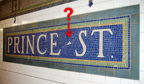
What is this triangular symbol?

While waiting for the subway to arrive, I noticed this mysterious symbol between “PRINCE” and “ST.” This is not a mistake of any kind. All of the signs at the station had this little triangle, and whoever created these signs put a significant amount of effort in inserting it. (Just look at how it is tiled.) Obviously this was something important for the artist who created this mosaic sign. What could it mean? It could not be a dash. Firstly, a dash would be inappropriate for this context. Secondly, if it were meant as a dash, it would have been much easier to draw a straight line out of these square tiles (instead of a triangle).
(FYI: This is New York City.)


It's just a freakin interpunct!!! The mosaic is roman, the romans wrote in Latin, and way back when, they didn't use spaces to separate words, so they used and interpunct. Mosaic=Roman=Latin=Interpunct!!
Bill1 Feb-10-2008
3 votes Permalink Report Abuse
Lets go under the duvet
Melissa3 Dec-18-2007
2 votes Permalink Report Abuse
Shame on me !!! "were" not "where" J... Sorry!!!!
Sassan Dec-16-2007
2 votes Permalink Report Abuse
i.e. http://www.livius.org/aa-ac/achaemenians/XPg.html
Sassan Dec-16-2007
2 votes Permalink Report Abuse
Oh! I Forgot to say that in the Old Persian scripts, the "" signs where barriers of the words; just like space in English.
Sassan Dec-16-2007
2 votes Permalink Report Abuse
Hi !
It seems even Persian to me !! sorry! :D
http://www.avesta.org/op/op.htm
What do you think ?
Sassan Dec-16-2007
2 votes Permalink Report Abuse
I'm pretty sure that it's an interpunct.
Dredsina1 Dec-13-2007
2 votes Permalink Report Abuse
This sign is probably designed for people to read it from a distance and in a hurry. The mark can act like a visible space. Like serifs make reading text easier without the reader noticing them, this mark could be something a person doesn't consciously see from a distance but his brain picks up. This way he doesn't see Princest, but Prince St. (For that matter, maybe the designer wanted to avoid an offensive word that appears without the space and then had to put it on all the signs for consistency!)
Aunt_B Nov-16-2007
2 votes Permalink Report Abuse
It may be this or that, but it has to have a purpose.
What's that?
The creator (author) wants to convey a specific meaning by "the writing on the wall".
In other words, that is to distinguish 'the writing' from other commonly and readily interpreted terms.
In this case other interpretation like princet or Prince's St or princest (sic) etc. are to be specifically kept at bay, by way of interjecting this symbol.
That's it; the communication, so what if it is in English.
xplusak Oct-31-2007
2 votes Permalink Report Abuse
Not only were you right "too", John. Your explanation was BETTER, much more specific.
porsche Oct-15-2007
2 votes Permalink Report Abuse
Hold on, if Patrick's right then I'm right too. Interpunct is the name of the Latin separating dot.
John4 Oct-15-2007
2 votes Permalink Report Abuse
Patrick´s explanation is the only correct one. See any Roman age inscription writen in stone. The triangular shape of a dot is determined by the technique of writing in stone - it is determined by the shape of the employed tool and by the character of the material - stone. The dots in Roman age stone-carved inscriptions are always triangular. This mosaic inscription only wants to look like a Roman age inscription written in stone.
Susan1 Oct-15-2007
3 votes Permalink Report Abuse
To clearly indicate it's "Prince" AND "street" -- and not "princest" (especially from certain angles)..but I like Nadir's explanation better.
common_sense Oct-10-2007
2 votes Permalink Report Abuse
It's probably a hyphen. My local newspaper hyphenates street names (e.g. High-street) and though I find it odd, it must've been a reasonably popular custom at one time.
dadge Oct-01-2007
2 votes Permalink Report Abuse
Excellent post, John. I thought this one would never get solved.
porsche Sep-13-2007
2 votes Permalink Report Abuse
It's an interpunct!
http://en.wikipedia.org/wiki/Interpunct
John4 Sep-13-2007
5 votes Permalink Report Abuse
Such separating characters were often used in Latin inscriptions, e.g. the Pantheon - see http://en.wikipedia.org/wiki/Image:Pantheon_rome_2005may.jpg
The separating characters helped clarify the text, which contained multiple abbreviations and the convention of spacing between words had not evolved.
Used here, however, it appears to be simply a decorative element.
Patrick1 Sep-12-2007
2 votes Permalink Report Abuse
It's a decorative element, not a grammatical one. Take it out and the two words seem to float apart.
Nan1 Sep-04-2007
3 votes Permalink Report Abuse
Hi Nadir,
That would be very interesting if that were true, but I'm not sure about that. As you can see below, it's quite off from where the true Pythagorean triangle should be (3-4-5 ratio). If the artist truly believed in mathematical beauty, I think he/she would have been much more precise.
To me it resembles an "acute" symbol, like the one on top of the 'e' on "café". I have a feeling that there was a functional reason.
Dyske Sep-04-2007
2 votes Permalink Report Abuse
It's Pythagoras' triangle. In its most esoteric form, the base is the mother, the height is the father, and the hypotenuse is the son aka: the perfected man. Its place on the sign of Prince St doesn't surprise me as princes (as well as other nobles and the like) look to the allegory as a part of some masonic religious icon.
This is not a case of English diction gone awry, but rather Masonic imagery cleverly disguised in a sign. I wouldn't be surprised if there's a square and compass surrounding a "G" placed elsewhere in the station.
Nadir Sep-04-2007
4 votes Permalink Report Abuse
Interesting. It has to be a separation character because it seems like it and it doesn't look like part of either word. I'll investigate on that.
it0ny Sep-02-2007
3 votes Permalink Report Abuse